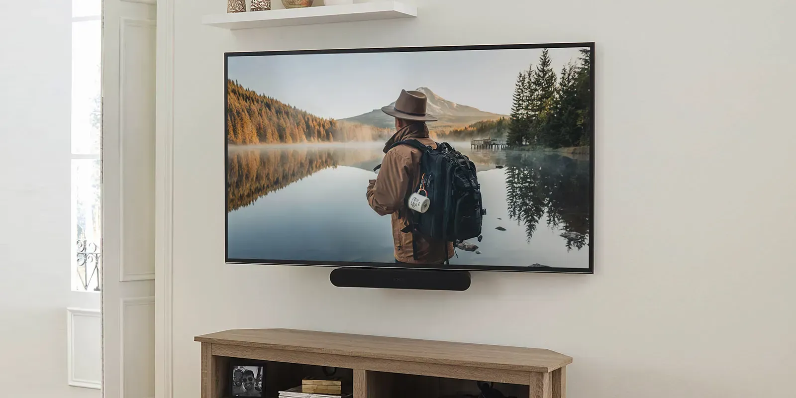
SANUSTransform your AV experience
SANUS is an established brand in the TV mount space. In fact, they’re the juggernaut of TV mounting. No one currently sells as many as they do. Their goal is to educate the consumer on why they should mount and then help them best find a solution for that. But when you’re the biggest, sometimes you need to take things up a notch after awhile. SANUS has a new site that does just that.
As lead on this project, I was responsible for the overall design direction as well as the build, deciding not just how something should work, but how it should look and feel as part of SANUS’s broader rebrand.
What was old, is new
SANUS had a lot of various tools on their old site to help people not only learn about mounting, but find the perfect mount for them. Unfortunately, the site had become outdated not only with the tools, but in their implementation and the site’s overall look. The new site helped launch the new branding initiative for SANUS.
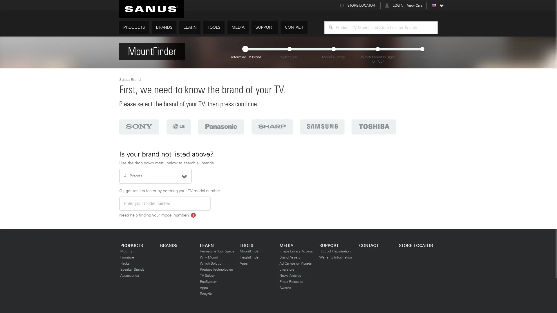
Leading this redesign meant deciding how much of the old site’s functionality to carry forward versus rethink from scratch. The MountFinder and HeightFinder tools were core to how people actually used the old site, so rather than starting over, we kept their logic intact and rebuilt the experience around it. We modernized the interface and interaction without asking returning users to relearn a tool they already trusted.
Any device, anywhere
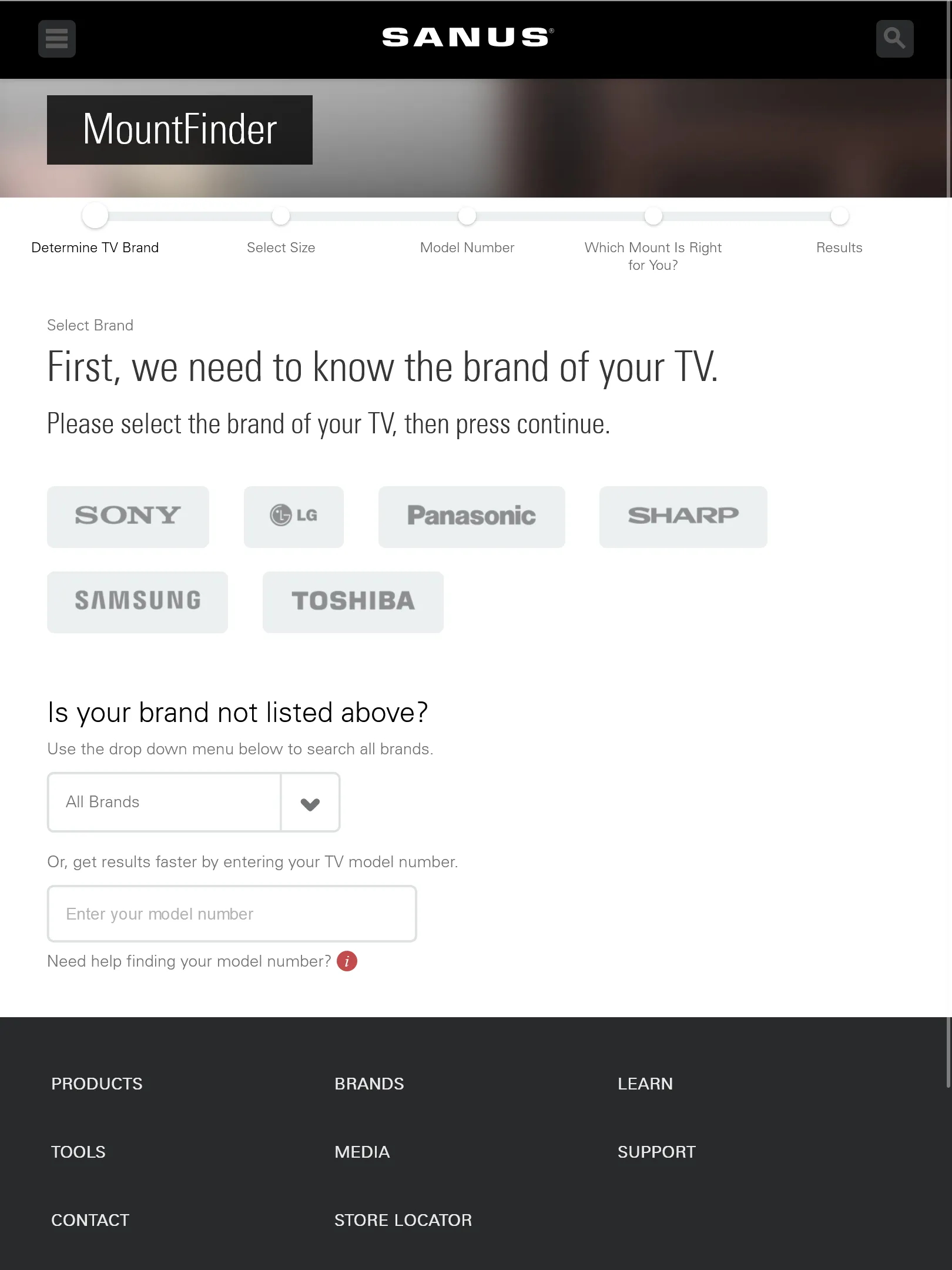
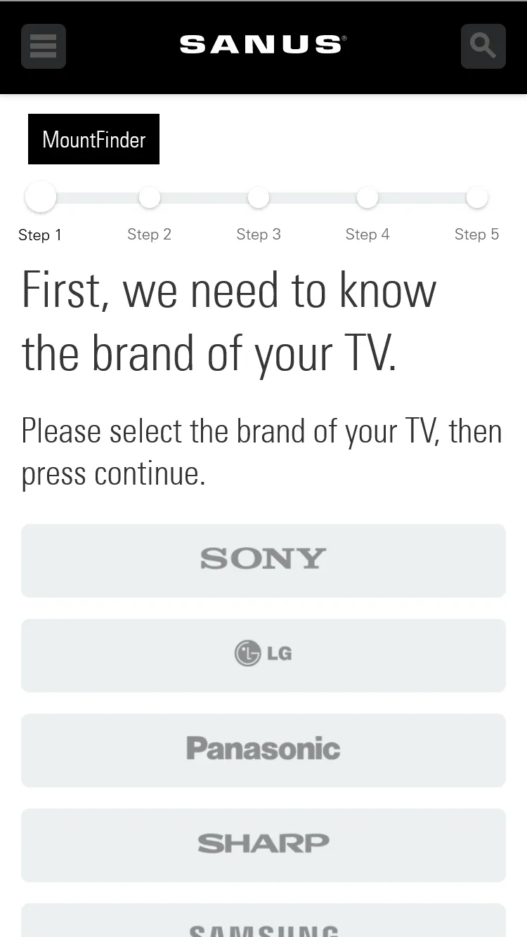
The new site was built with responsive design in mind from the beginning, including their web tools. The new site featured a store locator and redesigned MountFinder and HeightFinder tools, which help people not only find a new mount that’ll work well with their TV, but also where to drill on the wall they want to mount on. All of these tools work with touch devices at a wide range of screen sizes, making it easy to use in any situation.
Designing these tools mobile-first was a deliberate call, not a default. SANUS’s own data showed a large share of in-store and in-aisle use, where someone is standing in front of a wall with their phone deciding what to buy. That context shaped decisions down to touch target sizing and how much information we could reasonably ask someone to input one-handed.
There have also been tons of smaller site improvements to speed, UI and transitions, and organization to help enhance the experience even further for their users.